Table of Contents
Introduction
The OPERAS Metrics Widget is a small, embeddable metrics dashboard for scholarly works. It fetches event data from the OPERAS metrics API (and the citations endpoint) and renders configurable graphs, tables, and summary figures.
The widget can be used in two ways:
- as a script-tag embed that reads configuration from the page
- as a React component distributed via npm (
@ubiquitypress/operas-metrics-widget)
In both cases, nearly all behavior is driven by configuration rather than code changes.
Implementing the widget requires:
- the work URIs and measure URIs you want to report on
- a container element in the page (or a React render target)
- a configuration object (JSON for embeds, or a typed
UserConfigin React)
Getting Started
Preferred: React / npm
If you are using React, install and render the component directly (recommended for typed configs and bundler-friendly usage):
npm install @ubiquitypress/operas-metrics-widget
import { MetricsWidget, type UserConfig } from '@ubiquitypress/operas-metrics-widget';
import '@ubiquitypress/operas-metrics-widget/widget.css';

const config: UserConfig = {
  // ... your configuration
};

export const Example = () => <MetricsWidget config={config} />;
If you are not using React, use the HTML embed below.
Events in React: the component accepts an optional
eventsprop with the same event names as the HTML embed. See Events for examples.Note: The npm package ships the React entrypoint and CSS (from
dist/npm). The script-tag/UMD bundle for HTML embeds is served via the published CDN/GCS paths (or from the builtdist/artifacts), not via the npm tarball.
reactandreact-domare peer dependencies (^18or^19).
HTML embed (non-React)
The first step is to add a HTML element to the page which will contain the widget:
<div id="metrics-widget"></div>
The widget is configured by default to search for an element with an id attribute of metrics-widget. This can be re-configured later.
JavaScript
The next step is to add the widget script logic. Within the page, add the following:
<script>
  window.operaswidget = (e => {
    if (document.getElementById(e)) return window.operaswidget;
    let t = document.createElement('script');
    (t.id = e),
      (t.src =
        'https://storage.googleapis.com/operas/metrics-widget/v1/latest/widget.js');
    let r = document.getElementsByTagName('body')[0];
    r.appendChild(t);
    let i = window.operaswidget || {};
    return (
      (i.eventQueue = []),
      (i.ready = e => {
        i.eventQueue.push(e);
      }),
      i
    );
  })('operas-metrics');
</script>
This script does two main things:
- imports the
widget.jsscript containing the core logic of the widget. - creates a window object called
operaswidgetwhich allows you to [un]subscribe to custom widget events, discussed in the events section.
⚒️ The minified version of the script above is recommended to improve performance, but you can also use or modify the unminified version in dist/index.html if needed.
ℹ️ In the example above, you will automatically receive the latest changes to the widget in the v1 release. If you wish to change or understand this behaviour, see Versioning.
Once you’ve added the <script> tag, you should see the following message in your browser console:
Error loading widget: Could not find a script with ID
operas-metrics-config.
This is expected until you add the configuration script tag described in the configuration section.
CSS
The final step is to import the widget’s CSS:
<link
  rel="stylesheet"
  href="https://storage.googleapis.com/operas/metrics-widget/v1/latest/widget.css"
/>
The widget has been designed with CSS Variables in mind, meaning you should be able to easily override the primary colours (discussed in the theming section).
Although it is recommended to use the default CSS and modify any classes where required, the widget can fully operate without the default stylesheet and you are welcome to create your own styles instead.
All classes within the widget are prefixed with mw__ to avoid any style conflicts.
ℹ️ Similar to the JavaScript code, you can also use either latest to always use the latest version of the widget’s CSS, or provide a specific version instead.
Versioning
Semantic Versioning
The widget uses semantic versioning. For example, if a release was labelled 1.2.3-alpha.4:
1is the major version number. It is incremented when there are breaking changes.2is the minor version number. It is incremented when functionality is added in a backwards-compatible manner.3is the patch version number. It is incremented when backwards-compatible bug fixes are made.alphaindicates a pre-release version, which may be unstable and might not satisfy the intended compatibility requirements.4is the pre-release version's iteration.
CDN Paths
CDN versioning is handled by grouping releases into their major versions, followed by the full semantic version of each release. For instance:
https://storage.googleapis.com/operas/metrics-widget/v{major}/{version}/widget.js
All releases within a major version are available in the /v{major}/ directory.
Every major version directory also contains a latest directory that contains the newest release within that major version. For example:
https://storage.googleapis.com/operas/metrics-widget/v{major}/latest/widget.js
Because minor and patch changes should not include breaking changes, you can usually use latest within a major version.
When breaking changes are released, they will be versioned under a new major version directory (eg. /v2/2.0.0). You will need to manually update to this new version if you are on a previous major version.
Note that even if you load /latest/widget.js, the widget’s internal {version} variable is still the concrete package version it was built with. This means the default cdn_images_url will point to /v{major}/{version}/images, not /latest/images. If you want images to follow latest, set cdn_images_url explicitly to a latest path.
And of course, there is no obligation to stick to the latest version, and using hard-coded version URLs will work just as well.
Custom CDN
If you wish to host the widget on your own CDN, replace the widget.js and widget.css URLs in Getting Started.
Images are also hosted in sub-directories, and you can override those in the widget Settings by providing a custom cdn_images_url. The cdn_scripts_url setting is retained for compatibility but is not used by the current build.
These strings support custom variables which will be replaced at runtime:
{major}: the major version{minor}: the minor version{patch}: the patch version{version}: the full version string{preRelease}: the pre-release token (for examplealpha.4)
For instance, you can see this being used in the default value for cdn_images_url:
https://storage.googleapis.com/operas/metrics-widget/v{major}/{version}/images
At runtime, {major} and {version} will be replaced with whatever version was defined in the project’s package.json during build time:
https://storage.googleapis.com/operas/metrics-widget/v{major}/{version}/images/hypothesis-logo.svg
Configuration
In order for the widget to run, it relies on another <script> tag containing its configuration in JSON format.
On the same page as the widget, add an empty JSON script:
<script type="application/json" id="operas-metrics-config">
  {}
</script>
Note that the id attribute operas-metrics-config is not configurable and must be named exactly.
Quick Reference
| Topic | Link |
|---|---|
| Settings | Settings |
| Options | Options |
| Components | Components |
| Tabs | Tabs |
| Scopes | Scopes |
| Graphs | Graphs |
| Locales | Locales |
| Events | Events |
Structure
The configuration object is broken down into five fields:
| field | type | purpose |
|---|---|---|
| settings | object | holds all core settings for the widget |
| options | object | holds any customisation options for the widget’s behaviour |
| tabs | array | an array of all the tabs that should be shown on the widget |
| locales | object | an object containing any localisation overrides or custom localisations |
| components | object | React-only overrides for certain loading components |
In practice, this may look something like this:
<script type="application/json" id="operas-metrics-config">
  {
      "settings": { ... },
      "options": { ... },
      "tabs": [ ... ],
      "locales": { ... },
      "components": { ... }
    }
</script>
Settings
The settings object contains all of the critical information the widget requires to work.
All of the properties within the settings field have default values that should allow almost all implementations to work without even defining this field in the configuration object.
Unless otherwise instructed, it’s likely the only setting you’ll need to specify is the locale.
| field | type | default value | description |
|---|---|---|---|
| base_url | string | https://metrics-api.operas-eu.org/events | a link to the API that provides the metrics |
| citations_url | string | https://metrics-api.operas-eu.org/citations | optional override for the citations endpoint. If omitted, the widget will try ${base_url} with /events swapped for /citations. |
| element_id | string | metrics-widget | the widget will be rendered within the DOM element that has this id attribute |
| locale | string | en-US | the locale to render the widget in (see Locales for more information on how this property works) |
| cdn_scripts_url | string | https://storage.googleapis.com/operas/metrics-widget/v{major}/{version}/scripts | (legacy) not used by the current build, which bundles JS deps from npm and lazy-loads them. |
| cdn_images_url | string | https://storage.googleapis.com/operas/metrics-widget/v{major}/{version}/images | a link to the directory containing the required widget images (eg. hypothesis-logo.png). more information about the variables available in this string can be found under Versioning. |
For cdn_images_url, the {version} variable in the URL will be automatically replaced by the version of the widget you are running (as defined in the Getting Started section). This isn’t needed, but recommended to prevent a mismatch between file versions.
ℹ️ If you are using the auto-updating latest version of the widget, {version} will still be replaced with the concrete version of the bundle you received.
Options
The options object allows you to configure the general behaviour widget.
| field | type | default value | description |
|---|---|---|---|
| default_graph_width | number | 100 | the default percentage width of a graph, if it does not have its own width property |
| hide_initial_loading_screen | boolean | false | if true, the widget will remain hidden until all navigation data has been loaded |
| load_graph_data_immediately | boolean | false | if true, the data for each graph begin to load as soon as the widget is ready, even if the tab is closed if false, data for each graph will only begin loading once it should be visible (aka. the tab is opened) |
| open_first_tab_by_default | boolean | false | if true, the first navigation tab will be opened by default |
| locale_fallback_type | string(mixed|supported) | mixed | if the provided Settings doesn’t have any available translations, the widget will fallback to a supported language. the fallback method is determined by this variable, either mixed or supported: - if mixed, the widget will always display browser-localisable strings (such as dates, numbers, and country names) in the language set by settings.locale, even if that locale has no text translations. - if supported, the widget will display browser-localisable strings in whatever language the widget had to fall back to |
Components (React only)
The components field lets you override loading UI when using the React entrypoint. It is not supported via the script-tag embed because JSON cannot contain React elements.
| field | type | description |
|---|---|---|
| initial_loading_screen | ReactElement |
shown while navigation counts are loading (respects hide_initial_loading_screen) |
| tab_panel_loading_screen | ReactElement |
shown while a tab’s graphs are loading |
Tabs
Within the widget, a tab is considered to be a single item shown in the navigation (eg. downloads, sessions, reads …) that, when clicked, will open a panel below the navigation with graphs:
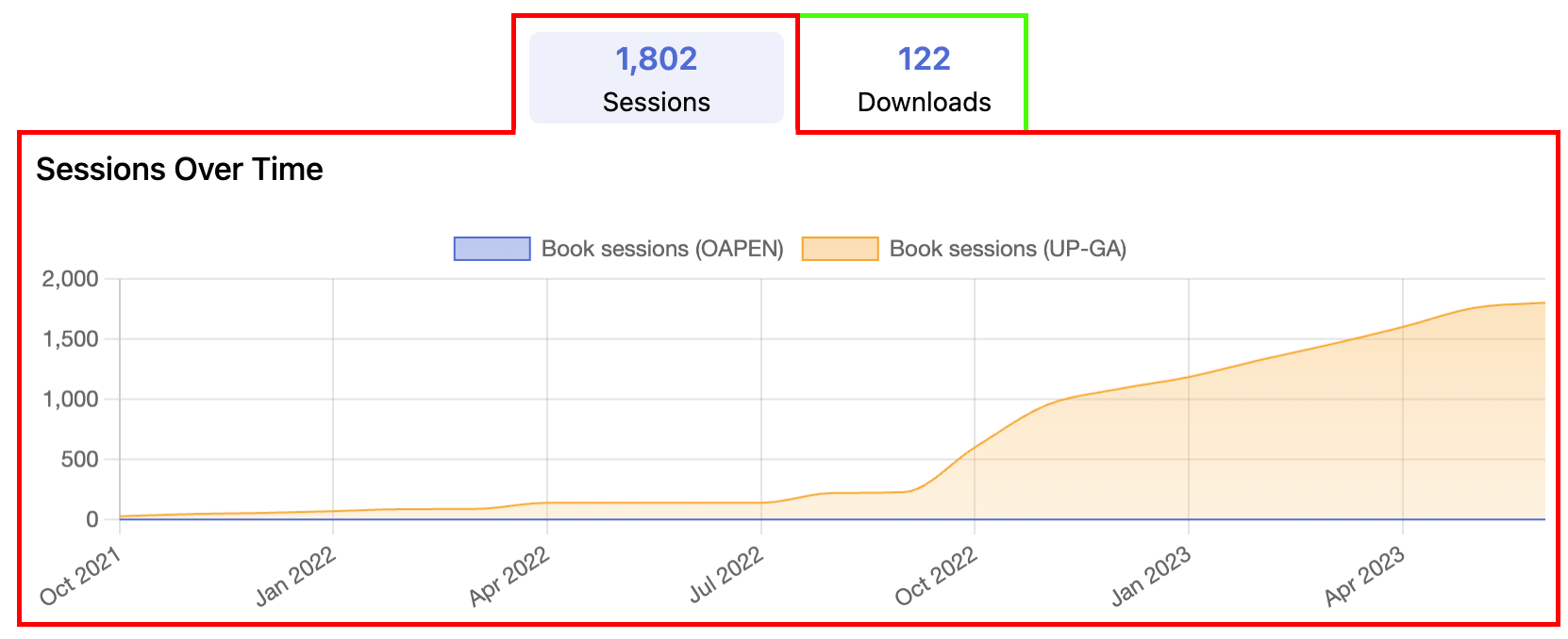
There are two tabs in this image: the Sessions tab (red outline), which is toggled open to reveal its graphs, and the Downloads tab (green outline) which is not toggled open but still appears in the navigation.
A Tab object contains the following properties:
| field | required | type | description |
|---|---|---|---|
| id | yes | string | the unique id of the tab, primarily used for accessibility purposes |
| name | yes | string | the display name of the tab, shown in the navigation |
| order | no | number | the display order of the tab in the navigation |
| scopes | yes | object | every key in this object represents a metrics “scope” - see below for more information |
| graphs | yes | array(Graph) | an array containing every graph that will be rendered within the panel of this tab (see below) |
Scopes
The scopes object allows you to group together specific metrics endpoints.
Each graph allows you to specify which scope(s) should provide its data, meaning that you can have additional flexibility for every graph.
ℹ️ When a tab is rendered in the navigation pane, the count value shown will be the total value of all scopes for that tab. In the image above, 1,802 is the total value of all scopes for that tab.
At minimum, a scope is just a name plus works and measures:
"sessions_scope": {
  "works": ["info:doi:10.5334/bbc"],
  "measures": ["up-logs/sessions"]
}
The following properties are accepted within your scope:
| field | required | type | description |
|---|---|---|---|
| works | yes | array(string) |
an array of the work URI tags that are part of the data for this scope. these will likely be given to you, and will look like any (or all) of these: - info:doi:10.5334/bbc.a- urn:uuid:b2e02743-2b36-4018-821c-55daa5305cf6- tag:ubiquitypress.com,2022 |
| measures | yes | array(string) |
an array of the measure_uris to include in the counts for this metric in essence, the API will respond with counts for all available metrics, such as up-logs/downloads, up-logs/sessions, up-logs/... and so on. in order to filter out metrics which aren’t relevant to your scope, you should provide a “whitelist” array of the ones that you do want to include.the widget will do a broad match for this, so if the measure_uri in the API response is https://metrics.operas-eu.org/up-ga/downloads/v1, and you have provided up-ga/downloads, or even just downloads as a measure, it will match.be careful not to be too vague with your URIs; simply writing up-ga would result in the widget including all Google Analytics metrics (downloads, sessions, logs, etc.) in the data. a good rule of thumb is to include the provider and type: up-ga/downloads. |
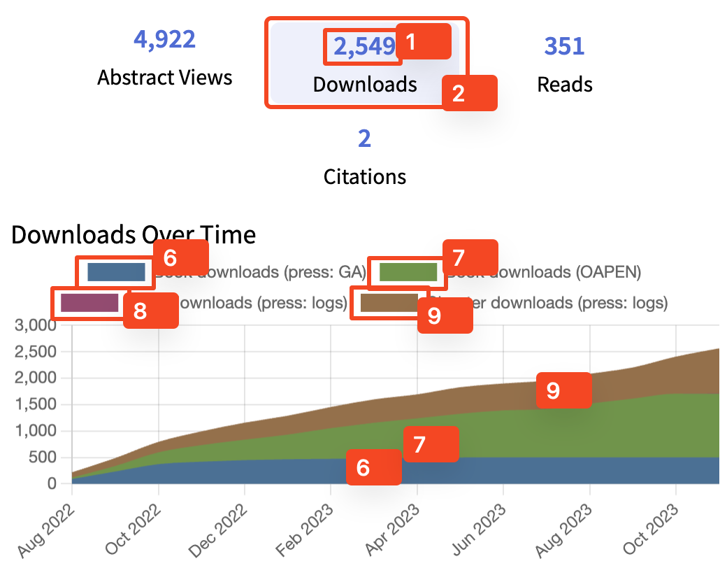
| title | no | string |
some graphs will show the title of each scope if it isn’t merging the values together. for instance, a stacked line graph might display multiple different values on a single chart - this is when the title field would be displayed. an example of this is below. |
| startDate | no | string |
the date to begin counting metrics from; useful if you are migrating from one provider to another and don’t want duplicate counts. the value must be parsable into a Date() call.as an example, a startDate set to "2023-07-01" will only begin counts within the scope that are on or after 1 July, 2023. |
| endDate | no | string |
the date to stop counting metrics from; useful if you are migrating from one provider to another and don’t want duplicate counts. the value must be parsable into a Date() call.as an example, an endDate set to "2023-07-01" will stop counting values with a date on or after 1 July, 2023. |
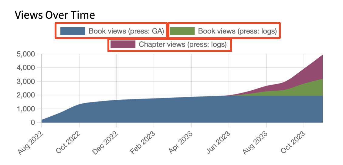
A stacked line graph with three different scopes. Each scope has specified a title property, outlined in red.
Scopes are intentionally small and composable: you can define multiple scopes, then decide which ones each graph should use.
Here is a concise “full” example inside a single tab:
{
  "scopes": {
    "book_sessions": {
      "works": ["info:doi:10.5334/bbc"],
      "measures": ["up-ga/sessions"]
    },
    "chapter_sessions": {
      "works": ["info:doi:10.5334/bbc.a", "info:doi:10.5334/bbc.b"],
      "measures": ["up-logs/sessions"]
    }
  },
  "graphs": [
    {
      "id": "book_sessions",
      "type": "line",
      "title": "Book sessions",
      "scopes": ["book_sessions"]
    },
    {
      "id": "combined_sessions",
      "type": "line",
      "title": "Book + chapters",
      "scopes": ["book_sessions", "chapter_sessions"],
      "config": { "stacked": true }
    }
  ]
}
There also are no limits on how many scopes you make either, so if you wanted to be extremely specific, there is nothing stopping you splitting all the URIs in chapter_sessions into their own sessions, like chapter_sessions_a, chapter_sessions_b, … and so on. This could allow you to make a stacked graph for every chapter individually, or dynamically update the config depending on which chapter a user is viewing.
ℹ️ The widget is designed to be as optimal as possible with network requests, caching responses in-memory. This means if you have multiple requests for the same data, only one network request will actually be made.
Graphs
Within the tabs object of your widget config, each tab must provide an array containing graph objects. For every graph listed in the array, it’ll appear within the tab when opened.
A Graph object is formed of the following fields:
| field | required | type | description |
|---|---|---|---|
| id | yes | string |
the unique identifier for this graph note that this value only has to be unique within the context of its parent (a Tab object). if you have two tabs, eg. downloads and tweets, it is completely fine for them to re-use the same id as this data exists on a per-tab basis. but you cannot re-use the same id value on two graphs the same Tab object |
| type | yes | string(text | line | country_table | world_map | hypothesis_table | tweets | list | citations) |
the type of graph to render note that some graphs support additional properties — see the graph type sections below for more details |
| scopes | usually* | array(string) |
an array of scopes that will contribute to the data for this graph the string in the array should match the name of a scope that exists in the configuration of this same Tab*some graphs (eg. Text) can work without any data, though most other graphs will not work as intended without at least one scope being provided |
| config | usually_ | object | some graphs require additional configuration, such as the Text graph requiring a content string*not all graphs require additional configuration, though you should refer to the documentation for the graph to see whether it requires any additional fields |
| title | no | string | the text to display above this graph |
| options | no | object | see below |
Options
Each graph has a configurable options object that allow you to configure it further.
The options object, and all fields within it, can be considered optional.
| field | type | description |
|---|---|---|
| width | number | the percentage width this graph will render as when the widget is rendering graphs, it will automatically calculate rows based on the cumulative widths up to 100%. for instance, if three graphs are present with widths [30, 70, 50], the widget will render two rows — the first with two graphs (one 30% width and the next 70% width), and a second row with one graph (50% width) if this value is not specified, the graph’s width will be set to whatever value is specified in the widget’s options.default_graph_width configurationin some cases, having the widget automatically handle rows for you can create undesired effects. the widget also allows you to specify your own rows of graphs, which will be explained in the next subsection |
| height | string | the string height this graph will have you must include the unit (eg. px) in this valueif this value is not specified, the graph will fall back to a default height hard-coded internally for the graph note that if a graph has no data (causing the No data available message to display) the graph will render with an auto height value to prevent excessive whitespace |
| maxHeight | string | the string max-height CSS property this graph will haveyou must include the unit (eg. px) in this valueif this value is not specified, the graph will fall back to a default height hard-coded internally for the graph (currently only the list graph has a default for this) |
| class | string | a string of any CSS classes to attach to this graph |
Configuration
The global options object allows you to specify certain values that affect all graphs:
| field | type | default value | description |
|---|---|---|---|
| default_graph_width | number | 100 | the default percentage width of a graph if it does not have its own width property |
Should you wish to modify the default values, you can override the value by adding the field into your widget configuration’s options object.
Some graphs support additional configuration, within a config object. The difference between the config and options objects, despite some graphs requiring both, is that options are general configurations that any graph can have, whilst config are configurations that are exclusive to that graph (eg. a Line Graph may support config options that a Text graph doesn’t, but both will support the same options).
Text (text)
The text graph is the most generic graph as it simply renders text content in its place.
| field | type | description |
|---|---|---|
| content | string |
the text content to display |
| variable_regex | string |
the content field supports the use of variables. this regex tells the widget what syntax to look for to replace variables.the default value is {(.*?)}, which will replace any text surrounded by curly braces, eg: {name} |
| html_support | string('none'|'safe'|'unsafe') |
when rendering the content field, HTML formatting will depend on the value provided:- none will not parse any HTML content- safe will parse HTML content using the dompurify library- unsafe will parse HTML without any sanitisationthe default value is safe. |
Variables are supported within the content string, and is simply a key surrounded by a pattern, such as {variable}. By default the regex pattern is {(.*?)}, but this can be modified by overriding the variable_regex configuration on a per-graph basis.
The following variables are supported:
| variable | description |
|---|---|
| app_version | returns the current version of the widget (eg. 1.0.3) |
| scope name | if a variable name matches the name of one of the graph’s scopes, it will render a formatted number representing the total count of that scope for instance, if you have a scopes array of [book_downloads, chapter_downloads] and your content string were to say “Some text: {book_downloads}”, the widget would replace the {book_downloads} variable with the total count: ”Some text: 1,293” |
Scope variables are only populated for scopes listed in the graph’s scopes array. If you want {my_scope} replacements, include my_scope in graph.scopes.
Line (line)
The line graph will render a line graph of all scopes provided to it. Additional configuration allows you to control whether each scope will be merged together into a single line (the default behaviour), or to render as a “stacked graph” which has each scope drawn out separately.
By default, the line graph will automatically calculate the most appropriate x-axis labels depending on the range of data available. The default logic (’auto') can be found in the range description of the table below.
This ensures that you always receive a good amount of data being visualised without the graph becoming too slow. If for any reason you wish to change this behaviour, it can also be configured.
| config | default value | description |
|---|---|---|
| cumulative | true |
if true, the line graph will always trend upwards as it combines all previous metrics together, eg:1 May: 10 (shown as 10 on the y-axis) 2 May: 5 (shown as 15) 3 May: 2 (shown as 17) if false, the graph’s y-axis will correlate to the actual amount of metrics for the given date, eg:1 May: 10 (shown as 10 on the y-axis) 2 May: 5 (shown as 5) 3 May: 2 (shown as 2) |
| stacked | false |
if true, each individual scope provided to the graph will be rendered as its own unique line in a stacked graph. these lines can be styled by passing CSS variables into the widget, explained below.if false, every scope provided to the graph will be merged into a single line graph. |
| range | 'auto' |
controls the x-axis labels for the graph if 'auto', the behaviour is as follows:• if no. of years >=10, show years • else, if no. of months >1, show months • else, show days you can instead specify a specific unit to show, such as 'years', 'months', or 'days'.be advised that 'days' can be a very expensive process if you have a lot of data, as it needs to calculate the values for every single day. |
| begin_at_zero | false |
if true, the graph’s y-axis will always have a 0 present if false, the graph will start from a reasonable value within range of your smallest data point |
| artificial_zero | false |
if true, the graph will add an artificial 0 data point before every other data point (so long as the first data point isn’t already 0). this data point will be given a date earlier than all other data points, and the date given depends on whether the x-axis should be displayed on a per-day basis or a per-month basis if per-day, the date of the artificial zero will be one day before the earliest data point. if per-month, the date of the artificial zero will be one month before the earliest data point |
| background | 'fill' |
changes the style of the background to either: - 'gradient': a gradient fill will be set as the background- 'fill': a solid colour will be set as the background- 'none': there will be no background, just a border |
| border_width | 1 |
controls the width (a number in px) of the lines. |
In the event a graph only has one data point, an artificial 0 will always be prefixed as an arbitrary data point to ensure something can be shown. This happens regardless of your artificial_zero config.
Styling
The line graph uses the chart.js library for rendering, which renders a canvas element in the DOM. As such, styling of the graph cannot be done via conventional CSS.
To support styling, the widget will check the widget’s container element (the element that your config.settings.element_id defines (default metrics-widget)) for CSS variables:
| variable | fallback(s) | description |
|---|---|---|
--color-line-graph-x |
--color-primary, #506cd3 |
the colour of the line graph and its border for the border, this colour will be used directly for the gradient fill, this colour will have a maximum opacity of 0.6the x must be replaced with a number, and must start from 1, also increasing by 1 for every other colour. eg:--color-line-graph-1: #506cd3;--color-line-graph-2: #f5a623;when the graph is rendered, starting with the first index ( --color-line-graph-1), that colour will always be used. if you are using a stacked graph, meaning multiple lines will be rendered, each additional line will take the colour of the next index defined.note that the order of your scopes will also determine which order they appear in the graph, and thus determine which colour they are given. |
Country Table (country_table)
The country table graph will display a key/value list of country names and their counts.
It does not support any custom configuration.
World Map (world_map)
The world map graph will render a Mercator projection map with the more popular data points being represented by a darker fill colour.
It does not support any custom configuration.
Styling
The world map graph uses the jvectormap library for rendering, which renders a canvas element in the DOM. As such, styling of the graph cannot be done via conventional CSS.
To support styling, the widget will check the widget’s container element (the element that your config.settings.element_id defines (default metrics-widget)) for CSS variables:
| variable | fallback(s) | description |
|---|---|---|
--color-world-map |
--color-primary, #dbe1f6 |
the base colour of the map that all countries will be filled in as note that CSS colour keywords (eg. red, blue, …) may not work |
--color-world-map-dark |
--color-secondary, #899de2 |
a darker hue of the primary map colour that will be used to represent a more popular data point note that CSS colour keywords (eg. red, blue, …) may not work |
Hypothesis Table (hypothesis_table)
Renders a table element with Hypothesis data.
It does not support any custom configuration.
Tweets (tweets)
Renders a list of tweets.
The widget will display 4 tweets at a time followed by a “load more” button if there are more data points.
In order to reduce load times, the widget will actually 4 more tweets on top of this, but will keep them hidden until the “load more” button is clicked. Once the button is clicked, the next 4 tweets will be loaded and hidden until the user clicks again.
The graph does not support any custom configuration, but the number of tweets to display at once may be supported as a configuration option in the future.
List (list)
Renders a key-value list of data, particularly useful for metrics such as WordPress or Wikipedia.
It’s possible that you want to modify the “key" display before rendering the list, such as changing “my_key_name” to display as “my key name”. This can be done by providing an optional config property to the graph:
| config | type | description |
|---|---|---|
name_regex |
string |
the regular expression pattern containing a capture group eg. the pattern ([^\/]+$) will match the last subdirectory in a URL |
name_replacements |
object |
a key-value list of everything that should be replaced by this match eg. a key of "-" and value of "" will remove any hyphens found by the name_regex capture group |
Citations (citations)
Renders a paginated list of citing sources (articles, books, etc.) with metadata and links.
- Data source: the widget calls
settings.citations_url(defaulthttps://metrics-api.operas-eu.org/citations) once per scope withwork_uri=<your work>query params. It expects an array of records with fields likeauthors,editors,year,title,source,volume,issue,page,doi,url, andtype. The list is paginated client-side using the configpage_size. - Totals: the total shown is the sum of each citation record’s
value(defaulting to1whenvalueis missing). - Links: the DOI link is used if present; otherwise the
urlis used. - Measures: citation scopes currently use
worksand date filters, and do not filter bymeasures.
| config | type | description |
|---|---|---|
page_size |
number |
how many citations to show per page (defaults to 5) |
view_all_url |
string |
optional URL for a “View all citations” link |
show_inline_title |
boolean |
show the inline title inside the citations component (defaults to true) |
Custom Rows
Each graph supports an optional options.width value which will determine what percentage width to render the graph as. If this is not specified, the width will be based on whatever is specified in the widget’s options.default_graph_width configuration.
In certain cases this may cause some undesired effects. As such, an additional configuration has been provided to allow you to manually specify your own rows.
In order to define a row, your graphs array must contain a slightly different object, with the following properties:
| field | required | type | description |
|---|---|---|---|
id |
no | string |
the id attribute to be added to the row |
class |
no | string |
the class attribute to be added to the row |
graphs |
yes | array(Graph) |
an array of Graphs to render within this row |
Custom rows are “atomic”: once you define a row object, the widget will not merge other graphs into or out of it. You can freely mix custom rows with automatically laid-out graphs:
{
  "graphs": [
    {
      "id": "row-1",
      "class": "row-highlight",
      "graphs": [
        { "id": "sessions-line", "type": "line", "scopes": ["sessions"] },
        {
          "id": "sessions-map",
          "type": "world_map",
          "scopes": ["sessions"],
          "options": { "width": 50 }
        }
      ]
    },
    { "id": "sessions-table", "type": "country_table", "scopes": ["sessions"] }
  ]
}
Locales
The widget aims to be as localisable as possible, and in many cases defers localisation to the browser automatically. This is the case for formatting dates, country names, and numbers (eg. 1200 ⇒ 1,200 or 1.200).
Some translations within the widget (primarily ones that exist for accessibility) are hard-coded into the widget’s localisation files, but can easily be extended and overwritten in the configuration.
For other cases, the localisation is expected to be provided as part of a Tab or Graph, such as the name property on a Tab which determines what text will be rendered in the navigation bar or above an individual graph.
If you need to overwrite any pre-defined localisations within the widget, you can provide a locales object in the root of the widget config JSON. The initial key value must be the language code you wish to override, and the value should be a nested object of all locale fields. As an example:
{
  "locales": {
    "en-GB": {
      "loading": "Loading...",
      "navigation": {
        "label": "Navigation"
      },
      "graphs": {
        "empty": "No data available",
        "hypothesis": {
          "date": "Date",
          "author": "Author",
          "summary": "Summary"
        },
        "tweets": {
          "load_more": "More tweets"
        }
      }
    }
  }
}
Refer to src/widget/i18n/locales/en-US.json for the most up-to-date structure reference.
To set the widget to use the language you defined, you simply need to set the settings.locale string to match whatever language code was in the root of your tree.
You don’t necessarily need to re-write the entire JSON tree structure, as the widget will automatically fallback to a supported language if no localisation is found.
For instance, if you created a custom language overriding loading above, but didn’t override tweets.load_more, the former would show in your overwritten language but the latter would show in the fallback language.
Fallback
If the widget can’t find a localisation object in the settings.locale provided, it will fall back to the nearest possible supported language.
The order of operations is:
- If there is an entry in the localisation dictionary matching
settings.locale, use it. - If the
settings.localecode is 5 characters (eg.en-US), try the 2-character version (eg.en) instead. - Try to return the user’s
navigator.languagevalue, if it matches a defined locale. - Render the widget in the default locale,
en-US.
In the event that the widget does fall back to a different code than specified, it will output a warning into the browser console.
Note that if you are adding 5-character-long language codes to your locales object (eg. de-DE), the widget will automatically add a dictionary mapping for the 2-character language code, so you don’t need to add that manually. This means de-DE will be able to fall back to de automatically.
The widget will prioritise this by adding the first language code found, so you should always order your locales objects by the most common locale first. For instance, if you had:
de-DEde-AT
…and nothing else, the widget would copy the contents of de-DE into a dictionary for language code de. If the order was inverted, the widget would copy the contents of de-AT into a dictionary for de.
Browser Behaviour
In cases where the widget relies on the browser for localisations (numbers, dates, and country names), a configuration option exists in options.locale_fallback_type which allows you to customise how this is handled. The value for locale_fallback_type must be either of the following, and defaults to 'mixed':
| value | description |
|---|---|
'mixed' |
in the event the provided config.locale is not supported and the widget must fall back to a different locale, browser localisations will still be formatted in whatever language code was provided to config.localethis will result in a mixed locale display, as you may have the widget text in one language but the numbers, dates, and country names in another |
'supported' |
in the event the provided config.locale is not supported and the widget must fall back to a different locale, browser localisations will also be formatted in the same locale that was fallen back to |
Events
The widget is designed to emit events at key points, which can be invaluable for making the widget fit your needs.
Event Types
| name | arguments | description |
|---|---|---|
| widget_loading | () | emitted when the widget mounts and starts loading navigation data. |
| widget_ready | (tabs: { id, name, total, counts }[]) |
emitted when navigation counts are loaded and the widget can render. |
| tab_panel_loading | (tab: Tab) | emitted when a tab begins loading its graphs (usually on first open). |
| tab_panel_ready | (tab: Tab) | emitted when all graphs in a tab have finished loading. |
| graph_loading | (graph: Graph, tab: Tab) | emitted when an individual graph starts loading. |
| graph_ready | (graph: Graph, tab: Tab) | emitted when an individual graph finishes loading (even if it renders an empty state). |
Example
Here is an example illustrating every possible widget event, made possible by simply using a <script> tag on the same page as the widget:
<script>
  // Store events to be called by the widget when it is ready
  operaswidget.ready(w => {
    w.events.on('widget_loading', () => {
      console.log('the widget is loading');
    });
    w.events.on('widget_loading', () => {
      console.log('the widget is loading again');
    });
    w.events.on('widget_ready', tabs => {
      console.log('the widget has been loaded', tabs);
    });
    w.events.on('widget_ready', tabs => {
      console.log('the widget has been loaded x2', tabs);
    });
    w.events.on('widget_ready', tabs => {
      console.log('the widget has been loaded x3', tabs);
    });
    w.events.on('tab_panel_loading', tab => {
      console.log('the panel is loading', tab);
    });
    w.events.on('tab_panel_ready', tab => {
      console.log('the panel has been loaded', tab);
    });
    w.events.on('graph_loading', (graph, tab) => {
      console.log('the graph is loading', graph.id, 'in tab', tab.id);
    });
    w.events.on('graph_ready', (graph, tab) => {
      console.log('the graph has been loaded', graph.id, 'in tab', tab.id);
    });
  });
</script>
One notable feature here is that you can specify as many repeat events as possible, and each will be executed separately. For instance, there are three widget_ready listeners being defined, and each will be called sequentially once that event is triggered.
React example
The React entrypoint exposes an events prop with the same event names:
<MetricsWidget
  config={config}
  events={{
    widget_loading: () => console.log('widget loading'),
    widget_ready: tabs => console.log('widget ready', tabs)
  }}
/>
This is useful for driving your own loading states without inspecting the DOM.
Use-case Example
One common use-case for widget events might be to hide the widget’s container until it has finished loading. Since the widget doesn’t know if it has any data until it has finished loading, you may not want to show anything until we know there is data to be shown.
For example, let’s say we have the following UI that we only want to show once we know there is data available.
<section id="metrics-container" class="widget loading">
  <h1>Metrics</h1>
  <div id="metrics-widget"></div>
</section>
To do this, we could add some CSS so that widget.loading (the default state) will visually hide the widget. Then, we can simply add some JavaScript to listen to the widget_ready event to remove the loading class:
w.events.on('widget_ready', tabs => {
  if (tabs.length) {
    document.getElementById('metrics-container').classList.remove('loading');
  }
});
*Note you’ll probably want to add additional accessible attributes like aria-hidden, but that’s outside the scope of this documentation
You could also build on this to show a specific message/component if the widget loads without data being available.
Theming
The widget is designed to be as customisable as possible.
Almost, if not every, DOM element in the graph will have its own custom class name. All class names are prefixed with mw__ to prevent any style conflict clashes with your existing set up.
In the majority of cases, you can theme the widget by simply overriding the class of the element you wish to style.
CSS Variables
Some aspects of the widget, such as graphs that rely on a canvas element, cannot be modified directly by CSS. To support styling (and provide stable hooks), the widget reads CSS Variables from the container element.
The CSS selector that renders these variables must be placed on the widget’s container element (the element that your config.settings.element_id defines (default metrics-widget)).
For example, if your widget is loaded into <div id='metrics-widget'>, you will want to create a #metrics-widget CSS selector to define the variables.
This is due to the fact that the canvas-based graphs do not inherit colours, but instead specifically seek out specific CSS variables within the widget container element.
| variable | default | description |
|---|---|---|
--color-primary |
#506cd3 |
mainly used to set the colour of the navigation counts is also used as a backup by all graphs, if a more specific variable is not present |
--color-primary-light |
#edf0fb |
a lighter colour of your --color-primary variablemainly used as a background of the active navigation option |
--color-primary-dark |
#506bd3 |
a darker colour of your --color-primary variablemainly used as an outline of the active navigation option (when focused) |
--color-secondary |
#899de2 |
optional secondary colour used as a fallback for the world map’s darker shading |
--color-world-map |
#dbe1f6 |
see Graph object |
--color-world-map-dark |
#899de2 |
see Graph object |
--color-line-graph-x |
#506cd3 |
see Graph object |
Here is an example of how you would use the CSS variables:
#metrics-widget {
  --color-primary: #506cd3; /* [1] */
  --color-primary-light: #edf0fb; /* [2] */
  --color-primary-dark: #506bd3; /* [3] */
  --color-secondary: #899de2; /* [4] */
  --color-world-map: #dbe1f6; /* [5] */
  --color-world-map-dark: #899de2; /* [6] */
  --color-line-graph-1: #4b7094; /* [7] */
  --color-line-graph-2: #70944b; /* [8] */
  --color-line-graph-3: #944b70; /* [9] */
  --color-line-graph-4: #94704b; /* [10] */
}
Whilst all browsers should support CSS Variables, you are welcome to completely ignore them and manually override the individual widget classes in your own stylesheets.
Alternatively, the widget will still fully function even if you choose to not import the default widget.css file at all and opt to completely style it manually.
Development
Installation
- Run
npm installto install dependencies. - Run
npm run devto start the local dev server (webpack-dev-server).
Building
- Run
npm run checkto lint and typecheck. - Run
npm run build.
This produces:
- the embed bundle in
dist/ - the npm bundle and CSS in
dist/npm/ - TypeScript declarations in
dist/npm/types/
Releasing
Releases are automated via GitHub Actions on version tags (v*).
- Update the
versioninpackage.json(this is used at runtime for CDN asset paths). - Run
npm run check(and optionallynpm run build) locally. - Create and push a tag that matches the package version:
git tag v1.3.17
git push origin v1.3.17
On tag push, CI will:
- lint and typecheck
- build the embed and npm bundles
- publish the npm package (trusted publishing)
- upload
dist/to GCS under bothv{major}/{version}andv{major}/latest